|
|
Post by MDG on Apr 18, 2019 8:39:07 GMT -5
I'm not saying this artwork is bad by any means, but it reminds me of something an artist (I think it was Steve Bissette, but don't quote me--or him!) said at a convention. For some reason, we got on the subject of Gray Morrow, and he said, "Well, sure it's well drawn, but it's like watching TV!" |
|
|
|
Post by brutalis on Apr 18, 2019 8:49:49 GMT -5
I'm not saying this artwork is bad by any means, but it reminds me of something an artist (I think it was Steve Bissette, but don't quote me--or him!) said at a convention. For some reason, we got on the subject of Gray Morrow, and he said, "Well, sure it's well drawn, but it's like watching TV!" Ahhh yes, the classic static, no sense of movement, caught at the moment and talking head syndrome which has become a common style of many a comic book these days. That's okay for one panel but when the page or the entire comic is filled with such mundane (if nicely drawn) art it is easy to read but not so easily enjoyed over and over again. Oh for the glorious days of yore when heroes and villains bantered while delivering their punches to one another rather than delivering monologues. |
|
|
|
Post by Prince Hal on Apr 18, 2019 9:25:11 GMT -5
I'm not saying this artwork is bad by any means, but it reminds me of something an artist (I think it was Steve Bissette, but don't quote me--or him!) said at a convention. For some reason, we got on the subject of Gray Morrow, and he said, "Well, sure it's well drawn, but it's like watching TV!" And if similar layouts had appeared in Silver Age books, those who love this style would be criticizing it as bland and unimaginative. |
|
|
|
Post by rberman on Apr 18, 2019 10:07:56 GMT -5
I'm not saying this artwork is bad by any means, but it reminds me of something an artist (I think it was Steve Bissette, but don't quote me--or him!) said at a convention. For some reason, we got on the subject of Gray Morrow, and he said, "Well, sure it's well drawn, but it's like watching TV!" And if similar layouts had appeared in Silver Age books, those who love this style would be criticizing it as bland and unimaginative. I am fine with characters not flailing their body around in "caught in the middle of a jump" postures while they have conversations. If the worst that can be said of modern comics is that they focus on people talking rather than people punching, then give me modern comics. But hey, they're not for everyone, and that's fine too. |
|
|
|
Post by Prince Hal on Apr 18, 2019 10:17:20 GMT -5
And if similar layouts had appeared in Silver Age books, those who love this style would be criticizing it as bland and unimaginative. I am fine with characters not flailing their body around in "caught in the middle of a jump" postures while they have conversations. If the worst that can be said of modern comics is that they focus on people talking rather than people punching, then give me modern comics. But hey, they're not for everyone, and that's fine too. Well, sure there are times it works and times it doesn't, like the "puns 'n' punches" style you're talking about. But an overuse of either is usually not the best way to tell every type of story. |
|
|
|
Post by rberman on Apr 18, 2019 10:29:33 GMT -5
I am fine with characters not flailing their body around in "caught in the middle of a jump" postures while they have conversations. If the worst that can be said of modern comics is that they focus on people talking rather than people punching, then give me modern comics. But hey, they're not for everyone, and that's fine too. Well, sure there are times it works and times it doesn't, like the "puns 'n' punches" style you're talking about. But an overuse of either is usually not the best way to tell every type of story. It's always tricky to discern between preferences and absolute values in art. Judging impressionists or Cubists by the yardstick of the Dutch Masters, they all flunk big time. When an artist is striving for photorealistic art, as in that superteen seequence from Multiversity: The Just, I have something interesting to see beyond page layout, so I don't really care whether the images all form a surprise picture when you look at them together. Especially in that case, when the whole point is to lampoon Kingdom Come. But if you don't understand how the art is part of the satire, then yeah, the reading value is diminished.  |
|
|
|
Post by Prince Hal on Apr 18, 2019 10:40:24 GMT -5
Well, sure there are times it works and times it doesn't, like the "puns 'n' punches" style you're talking about. But an overuse of either is usually not the best way to tell every type of story. It's always tricky to discern between preferences and absolute values in art. Judging impressionists or Cubists by the yardstick of the Dutch Masters, they all flunk big time. When an artist is striving for photorealistic art, as in that superteen seequence from Multiversity: The Just, I have something interesting to see beyond page layout, so I don't really care whether the images all form a surprise picture when you look at them together. Especially in that case, when the whole point is to lampoon Kingdom Come. But if you don't understand how the art is part of the satire, then yeah, the reading value is diminished. Oh, I don't necessarily dislike or find aesthetically unpleasant that kind of art you've shown here; it's just that I think sometimes a particular style becomes first the rage and then the norm, and as a result artists (and this applies to writers and their styles, too) make it the go-to way to tell every kind of story. Witness second-person narration, which not only became the rule at EC, but became the narrative voice of choice for every company's horror/suspense line and thus lost its unique character and slipped into self-parody. At DC, the rigid six-panels per page layouts in many of the of their Silver Age comics probably saved a lot of time for their artists, but it worked against stories set in space, for a quick fer-instance. "Cinematic" layouts would have been of huge help to Legion stories, for one, but you didn't see anything even close to that until maybe the arrival of Shooter, who brought with him the influence of what Marvel artists were doing. |
|
|
|
Post by rberman on Apr 18, 2019 10:47:25 GMT -5
It's always tricky to discern between preferences and absolute values in art. Judging impressionists or Cubists by the yardstick of the Dutch Masters, they all flunk big time. When an artist is striving for photorealistic art, as in that superteen seequence from Multiversity: The Just, I have something interesting to see beyond page layout, so I don't really care whether the images all form a surprise picture when you look at them together. Especially in that case, when the whole point is to lampoon Kingdom Come. But if you don't understand how the art is part of the satire, then yeah, the reading value is diminished. Oh, I don't necessarily dislike or find aesthetically unpleasant that kind of art you've shown here; it's just that I think sometimes a particular style becomes first the rage and then the norm, and as a result artists (and this applies to writers and their styles, too) make it the go-to way to tell every kind of story. Witness second-person narration, which not only became the rule at EC, but became the narrative voice of choice for every company's horror/suspense line and thus lost its unique character and slipped into self-parody. At DC, the rigid six-panels per page layouts in many of the of their Silver Age comics probably saved a lot of time for their artists, but it worked against stories set in space, for a quick fer-instance. "Cinematic" layouts would have been of huge help to Legion stories, for one, but you didn't see anything even close to that until maybe the arrival of Shooter, who brought with him the influence of what Marvel artists were doing. That makes sense. Just to clarify: When you said that the layouts themselves were "bland and unimaginative," what alternative did you have in mind? I mentioned designs where the panels combine to form one big picture, but that's rare. Are you talking about panels that overlap, or characters that exceed the panel, or what? |
|
|
|
Post by Prince Hal on Apr 18, 2019 10:57:09 GMT -5
Oh, I don't necessarily dislike or find aesthetically unpleasant that kind of art you've shown here; it's just that I think sometimes a particular style becomes first the rage and then the norm, and as a result artists (and this applies to writers and their styles, too) make it the go-to way to tell every kind of story. Witness second-person narration, which not only became the rule at EC, but became the narrative voice of choice for every company's horror/suspense line and thus lost its unique character and slipped into self-parody. At DC, the rigid six-panels per page layouts in many of the of their Silver Age comics probably saved a lot of time for their artists, but it worked against stories set in space, for a quick fer-instance. "Cinematic" layouts would have been of huge help to Legion stories, for one, but you didn't see anything even close to that until maybe the arrival of Shooter, who brought with him the influence of what Marvel artists were doing. That makes sense. Just to clarify: When you said that the layouts themselves were "bland and unimaginative," what alternative did you have in mind? I mentioned designs where the panels combine to form one big picture, but that's rare. Are you talking about panels that overlap, or characters that exceed the panel, or what? I hadn't realized that you were referring to that kind of panel. Those can be great. I was referring to the succession-of-talking-heads style. Which can be compelling at times. Witness many an EC story or portions of Watchmen. The latter's nine-panel arrangement never really bothered me; I looked at it as a kind of parameter that Moore and Gibbons had decided to live within for various artistic reasons. They seemingly challenged themselves to tell a powerful story in that format and made it work, like a filmmaker given a small budget of time and money. |
|
|
|
Post by MDG on Apr 18, 2019 11:26:30 GMT -5
And if similar layouts had appeared in Silver Age books, those who love this style would be criticizing it as bland and unimaginative. I am fine with characters not flailing their body around in "caught in the middle of a jump" postures while they have conversations... Dialogue scene can be dynamic without flailing. |
|
|
|
Post by rberman on Apr 18, 2019 11:26:44 GMT -5
That makes sense. Just to clarify: When you said that the layouts themselves were "bland and unimaginative," what alternative did you have in mind? I mentioned designs where the panels combine to form one big picture, but that's rare. Are you talking about panels that overlap, or characters that exceed the panel, or what? I hadn't realized that you were referring to that kind of panel. Those can be great. I was referring to the succession-of-talking-heads style. Which can be compelling at times. Witness many an EC story or portions of Watchmen. The latter's nine-panel arrangement never really bothered me; I looked at it as a kind of parameter that Moore and Gibbons had decided to live within for various artistic reasons. They seemingly challenged themselves to tell a powerful story in that format and made it work, like a filmmaker given a small budget of time and money. In The Dreamer, Will Eisner shows Golden Age nine panel grids as an editorially imposed edict to get more art out the door faster, at the expense of creativity. Nine panel grids are such a rarity in the comics I've read (mostly Bronze and later) that I assume they were chosen specifically as an artistic statement rather than for reasons of efficiency. Modern nine-panel projects often break out of the stricture for the demands of a specific panel, combining multiple horizontal or vertical panels as needed for the image at hand. Some projects demand another approach in the first place, as in this dimension-hopping sequence by Ryan Sook from Seven Soldiers: Zatanna #1.  Elsewhere in that same mega-story ( Seven Soldiers: Shining Knight #3 to be precise), Simone Bianchi was working hard to come up with interesting layouts for whole issues that essentially consisted of characters giving exposition in conversations and monologues:  |
|
|
|
Post by rberman on Apr 18, 2019 11:31:23 GMT -5
I am fine with characters not flailing their body around in "caught in the middle of a jump" postures while they have conversations... Dialogue scene can be dynamic without flailing. I have no complaint with these pages but am also not sure how the word "dynamic" applies. The first page uses a variety of different panel sizes and different shots, including one close-up of a body part (hand on elbow) to draw attention. The second page is a six panel grid of two characters walking and talking, and the camera varies as to whether they are seen from behind or the side of the front. Is that what you meant by "dynamic" or is there something else at work? |
|
|
|
Post by Deleted on Apr 18, 2019 12:44:18 GMT -5
A lot of this discussion about art styles hearkens back to Scott McCloud's analysis of the four tribes of comic creators/readers in Making Comics, which we discussed in this thread. What appeals to one tribe often alienates others because it has a different priority. Most of the posters here likely fall in the Animist tribe as described by McCloud (with a touch of Classicist in some), while many more modern creators/readers are far more influenced by the Formalist tribe, and those efforts often seem an anathema to more traditionalist readers/fans of classic comics. Personally, I like that there is room for all four in comics, but I have stronger affinities to particular tribes than to others. But most super-hero comics default to Animalist and that is the tribe most fans of super-hero comics likely have affinities to. However, most people tend to judge all comic art by the standards/goals of the tribe they identity most with (whether consciously or unconsciously) and discussions between adherents of different tribes about comics art often devolve into people entrenching themselves based on the standards of their own preferences/affiliation without even looking at different perspectives, so end up going in circles and changing no one's mind. -M |
|
|
|
Post by rberman on Apr 18, 2019 14:04:15 GMT -5
A lot of this discussion about art styles hearkens back to Scott McCloud's analysis of the four tribes of comic creators/readers in Making Comics, which we discussed in this thread. What appeals to one tribe often alienates others because it has a different priority. Most of the posters here likely fall in the Animist tribe as described by McCloud (with a touch of Classicist in some), while many more modern creators/readers are far more influenced by the Formalist tribe, and those efforts often seem an anathema to more traditionalist readers/fans of classic comics. Personally, I like that there is room for all four in comics, but I have stronger affinities to particular tribes than to others. But most super-hero comics default to Animalist and that is the tribe most fans of super-hero comics likely have affinities to. However, most people tend to judge all comic art by the standards/goals of the tribe they identity most with (whether consciously or unconsciously) and discussions between adherents of different tribes about comics art often devolve into people entrenching themselves based on the standards of their own preferences/affiliation without even looking at different perspectives, so end up going in circles and changing no one's mind. Taking McCloud's four Jungian categories as valid for the sake of argument, I wonder which of them I fall into as a consumer, if that's even an appropriate question to ask since McCloud was talking about creators. I like a story that reveals something true about its creator and the world. I like a story which is a solvable puzzle that I can win. I like photorealistic art. I like expressionist art that exaggerates reality for emotional effect. I like art and stories that reveal new detail the second time around. I like words and pictures that comment on each other in ironic ways. I like stories whose impact is enhanced by outside information which I possess, and which doesn't waste time telling me what I already knew. Where do I fit on the Jungian grid? 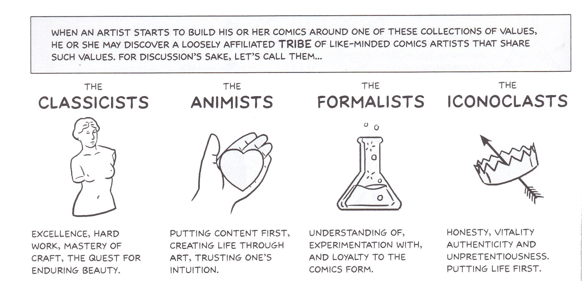 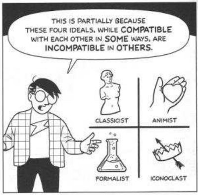 |
|
|
|
Post by MDG on Apr 18, 2019 14:24:25 GMT -5
I have no complaint with these pages but am also not sure how the word "dynamic" applies. The first page uses a variety of different panel sizes and different shots, including one close-up of a body part (hand on elbow) to draw attention. The second page is a six panel grid of two characters walking and talking, and the camera varies as to whether they are seen from behind or the side of the front. Is that what you meant by "dynamic" or is there something else at work? I mean a sense of movement and flow, not of a series of static images. Also, especially in the Eisner example, showing the action and commenting on the action. Also, I'll go on the record as preferring comic art that has a handmade feeling, that acknowledges that it's drawn. Here's a beautiful page that's 50 years old, and it's beautiful, but I don't really like it. You can smell the photo-reference. It's great drawing, but it doesn't flow.
|
|